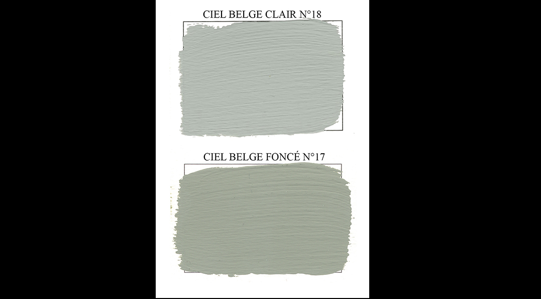
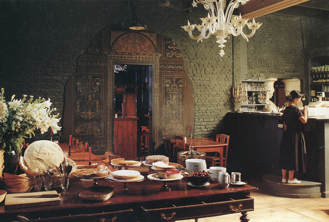
For a long time, I painted walls with lime, having discovered its velvety texture that seemed
to magically erase the feeling of confinement.
But lime is dusty and volatile, a rather archaic approach that was difficult to propose to my clients!
Moreover, the colour options are very limited, especially when you want to avoid toxic pigments.
In the early 1980s, I discovered a small, artisanal paint factory in Brussels, Linkckx Paonlin,
which had developed the most matte paint imaginable in 1934.
Specially designed to prevent reflections on cinema facades, as well as sets for theaters and television studios,
it perfectly met my aesthetic criteria.
I then began mixing paints from their range for my clients. This allowed me to thoroughly test the durability and
ease of application of their products. It was only natural, then, to ask them
to manufacture my paints when I wanted to market my own range of colours in 1996 for the EMERY&Cie brand.
But when, after 28 years, the partnership abruptly ended in 2024, I had to pack my bags and find another manufacturer.
Fortunately, in the meantime, many more or less artisanal brands had developed with criteria similar to my own.
So I quickly came across the ARGILE brand.
I think I was born into paints! At an age when others were playing with blocks, I gleefully devoured an enormous box of pastels
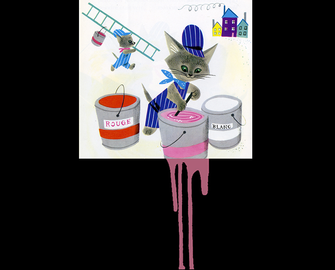
that my mother had inherited from a painter, a friend of my grandfather. My bedside books were “The scribbling Kittens”
(about a charming gang of clumsy little cats who would drop pots of paint, which would mix together, and thus discover the secret of colour mixing)
and a huge black and white book on Botticelli with a few colour plates.
It must be said that my family environment was very supportive of all my artistic endeavors.
My grandfather, an amateur watercolourist but nonetheless very professional in his rigor, caused me quite a few minor heartaches
by solemnly throwing away the lovely tube of white gouache that had been sitting next to my new paint boxes
because “white is the white of the paper.”
And so, more than with other subjects, talking about painting means talking about myself and my family.
I was that architecture student who always, against all odds, created her projects in colour in
a world rigorously devoted to black, white, and perhaps gray. Painting has been with me all my life;
I even worked as a decorative painter for years, creating frescoes and patinas in my own style
(they were more like glazes obtained by layering colours using the techniques of the old masters on an easel).
It was therefore perfectly natural for me to create a colour palette; I simply had to draw upon my experience.
And perhaps that is precisely what differentiates my palette from all the others that have sprung up since:
it is not the result of research in a design studio, but the living traces in my memory of so many construction sites
spent frolicking on scaffolding (like “the scribbling kittens”).
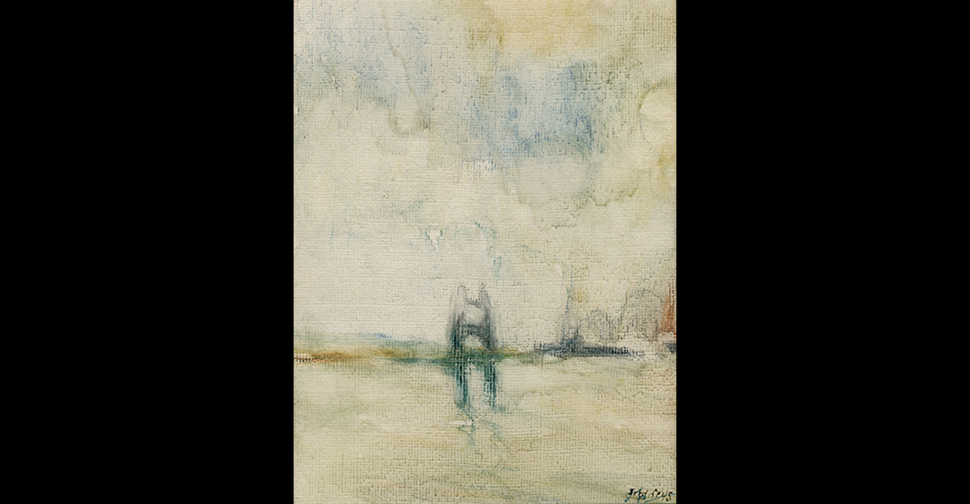
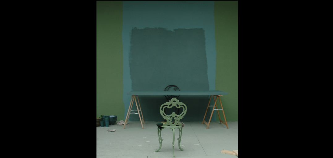
I would like to conclude by saying where these colours come from.
My long visits to museums and my reading of books certainly play a significant role,
but most often it is “the colour of the canal water opposite the Chien-Vert” that serves as a source of inspiration,
or an overly pale Belgian sky, or… but sometimes the names of the colours themselves tell the story just as well.