
From my long experience as a house painter and colour consultant, I retain a few deeply held beliefs.
Since I’m wary of certainties, I call them my “recipes.”
I’ve noticed, however, that no one seems particularly inclined to treat them so casually, and that they even generate
a certain amount of interest. So here’s a small selection… to be applied only if you like them.
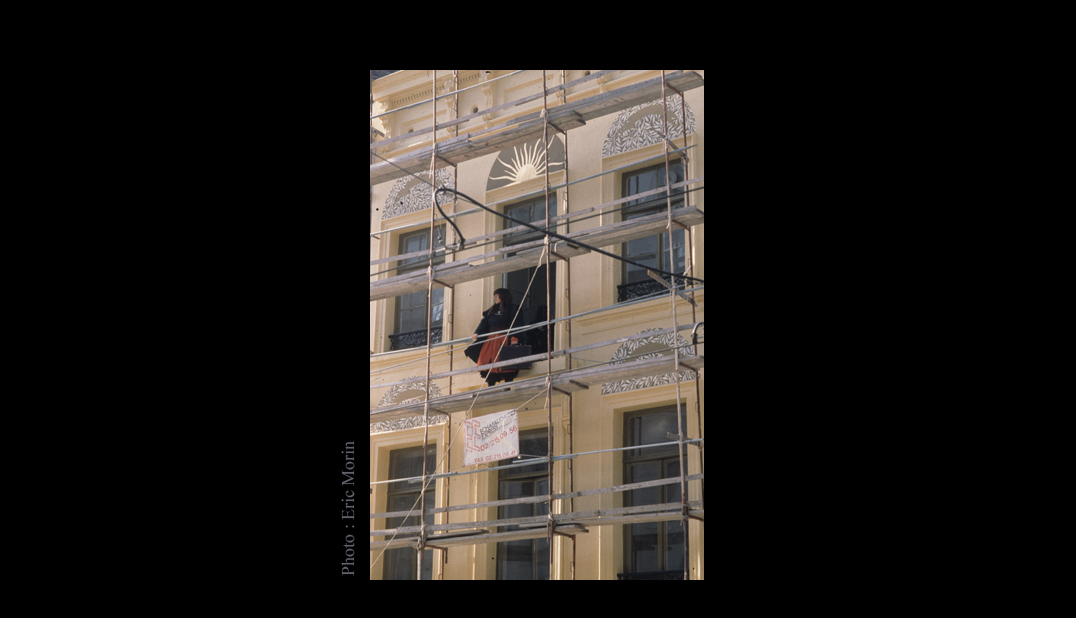
THE ART OF MAKING TWO COLOURS CLASH:
My mother always made fun of the “country ladies” who never went out without gloves that matched their bag and hat.
I wouldn’t dream of imitating her, and I even hope that such talk is outdated. However, this has stayed with me:
I also dislike gloves that match the bag and hat.
Certainly, I’ve always tried to find overall harmony among the different colours in the collection,
but I’ve never dismissed a colour that I found exquisite in the name of harmony,
because I often use what I charmingly call “tension” between colours—or rather, simply put, colour clash.
Because, as with many other aspects of life, it’s all about proportion.
Too many harmonious colours become tiresome and stifle the imagination; introducing a slight tension awakens interest.
And in any case, as far as the living spaces we are concerned, life itself generally does a very good job of introducing tension
into a universe that is too artificially composed by decorators or very assiduous readers of decoration magazines.

It’s always best to choose a colour based on natural daylight rather than artificial light.
Indeed, a colour that looks good during the day is generally also good in the evening, while the reverse is almost always true.
Furthermore, artificial light can be adjusted, which is obviously not the case with natural daylight.
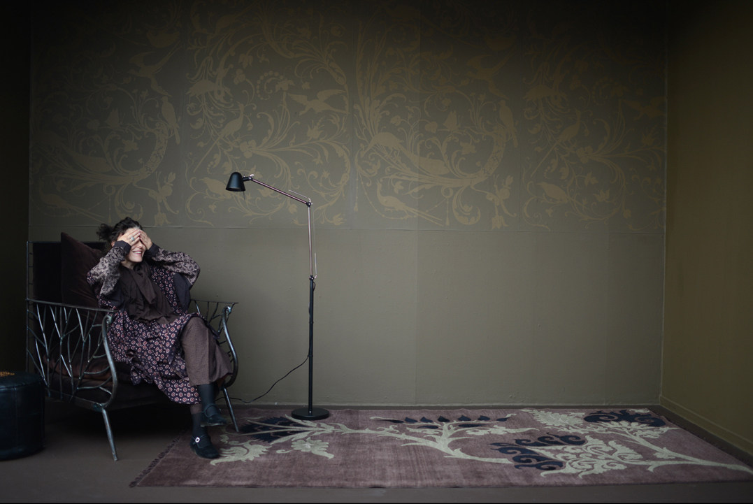
“You shouldn’t paint a dark room a dark colour,” they say…
But painting a dark room white has never made it bright; more often than not, it just becomes colder and sadder.
so, I prefer to accept that a room is dark and develop its atmosphere based on its inherent character,
rather than trying in vain to make it brighter against its nature.
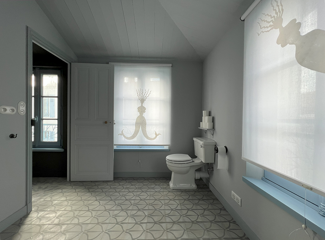
Colours obviously have the ability to construct or deconstruct a space, which goes far beyond mere interior design.
For example, I prefer to paint the ceiling the same colour as the walls, whether it’s low or high.
Because what matters most in the harmony of a room is the ratio between the surface areas of the different colours.
Since windows, doors, and the floor occupy part of the space, the wall colour is often not dominant enough;
it doesn’t fully inhabit the space. If the ceiling is yet another colour, even a neutral one,
the whole effect is disrupted, a jumble of small areas.
And ultimately, simply drawing the eye with another colour won’t correct a ceiling that’s too high or too low!